Article At Glance
- The secret to creating responsive emails is simplicity through single-column layouts and limiting images and straightforward links to enhance user experience.
- A single-column layout works consistently on all email clients and platforms like Gmail.
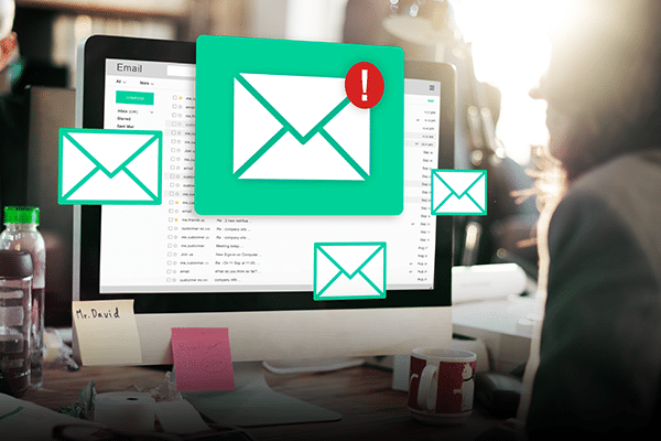
Don’t let the challenge of designing mobile-friendly or responsive email templates intimidate you. We’re here to reveal the top 5 tips for creating emails that look incredible on any device. Say goodbye to the frustration of your message looking perfect on one screen and completely different on another. We’ll guide you through the best practices for responsive email design so you can wow your audience every time.
Simplicity is Key: Unleash the Power of Minimalism
The secret to success lies in simplicity. Create emails focused on text with a simple HTML layout consisting of a single column. Limit the use of images and keep your buttons and links straightforward. With this approach, you’ll optimize for platforms like Gmail and enhance audience engagement by linking your call-to-action button to a slick Act-On landing page.
One-Column Wonder: The Design That Never Fails
When it comes to responsiveness, a single-column layout is the gold standard. It’s a tried-and-true design that works consistently across all email clients. You may need to rearrange your content to fit the single-column format, but the result is worth the effort. Say goodbye to unpredictable rendering and hello to reliable design.
Picture Perfect: Mastering the Art of Image Integration
Images can impact your message significantly, but handling them with care is essential. Opt for quality over quantity and avoid creating image-only emails. Data restrictions and email settings can prevent images from displaying correctly, so striking a balance is crucial. Remember to add alt text to describe your images, ensuring your message resonates even if images are blocked or fail to download.
Font Finesse: Choose Wisely for Optimal Results
Custom fonts can bring your emails to life, but not all fonts play nicely with different devices and email clients. To preserve your branding, use web-safe fonts as a fallback option. A comprehensive list of web-safe fonts can be found at W3 Schools, ensuring your messages always make a lasting impression.
Accessibility All-Stars: Making Your Message Inclusive
Everyone deserves to read your message, regardless of their abilities. Take accessibility into account by using high-contrast colors, adding alt text to describe images, and providing image captions when necessary. Avoid relying solely on font styling or color to convey important information. Make your links descriptive, and remember to include subject line preview text. Following these best practices ensures your message is accessible to all.
Designing emails that shine on any screen doesn’t have to be a headache in a world of diverse devices and email clients. With our top 5 tips, you’ll create stunning, responsive emails that captivate your audience and inspire action. Refrain from settling for mediocre design when you can dominate the inbox. It’s time to elevate your email game and conquer the digital landscape.
In conclusion, mastering the art of engaging email design is fundamental to succeeding in today’s digital landscape. If you’re interested in learning more about how we can assist you in creating effective email campaigns, or if you’d like to set up a recommendation call, don’t hesitate to contact us. Our team of experts is always standing by to help you achieve your goals and dominate the inbox.